Section 1
For my FMP (Final Major Project) I m going to choose a flower for the 2011, Chelsea Flower Show, in London and then take the flower and create the poster as well as many other advertisements. I hope to design something suitable for the age range as well as producing a design that is catchy and stands out. Once I design the poster I will illustrate other materials to help advertise the Chelsea Flower, such as: leaflets, banners, bags, umbrellas bags tickets badges even bracelets as well as many more.
Section 2
I’m going to start the project researching into the Chelsea Flower Show, looking at the history of the location, and the people who run the show and even the flowers. I’m also going to look into a range of artists, modern and historical to see what would suit my design more such as, Roy Lichtenstein, Andy Warhol, Van Goth, Sue Bartlett, Lucy Orchard, Nick Schlee and even Paul Wright, which all are artist, but use different medias, in their work and for historical artist. On the 26th March I’m going to London to visit the natural history museum the history museum and the science museum and even the V&A, where I’m sure to find really interesting historic artists as well as looking at Georgia O’Keepe and Mrs Delaney, I’m also going to look into Botanical Illustration, which is what the Chelsea flower show use every year. I will also look into Garden designs as these might give me ideas how to present my ideas or even which flowers to use I know already I need to find a flower that’s summery, bright and beautiful, like a rose or a daisy but more interesting, I’m going to ask the public (using a questionnaire) if they have been? I have they heard of the Chelsea Flower show?
I’m going to do research in the LRC, to see if there is any information on the Chelsea Flower Show as well as talking to the Floristry course in the college to get idea on the flowers, which I could use but first and foremost I’m going to contact the Chelsea flower show to see if they have pictures of the current flowers used though out the years as well as looking on the Chelsea flower show website (also creating a bibliography as I go). I have also booked tickets to the Chelsea Flower Show on the 25th May 2010 so I can take loads of pictures and do loads of drawings, as well as even talking to some people doing the Chelsea flower show and even the people that run it ever year!
Section 3
My first stage will be producing an illustration of a flower I will experiment with a range of different medias and even in the way I use the medias, showing different techniques, showing step by step as I go to different medias and especially with medias I have never used before.
I’m going to come up with a time scale so I have everything done by the finishing date:
Week 1 – Paper Work
Week 2 – Research into Chelsea Flower Show (as well as a trip to London for research)
Week 3 – Research into Artists
Week 4 – Experimental Work
Week 5 – Design Ideas
Week 6 – Develop Ideas
Week 7 – Develop Ideas
Week 8 – Final Outcome
Week 9 – Printing Company
Week 10 – Make sure it’s all completed
Section 4
Once my design is completed, I’m going to send it to Chelsea to see what they think of my outcome and to also gain feedback. I am also going to create a daily log to review my project. I will also check with class mates on my project and also to help expand my ideas to make sure my design turn out as well as possible and to the best if my ability. Thought out the project I will also be doing class crit where I will be evaluating peoples work as well as people evaluating mine, peer evaluation, as part of the brief I have to have people look at my project and evaluate it in detail, and along the way I’m going to do a tutors review which my tutor will make shore I’m on the right trace and make shore I now where to go next, as well as giving a advice where to go next. Once I come up with my final I need to research into printing prices, to get my design and my booklet printed. I also need to research into the type of paper and even the size of the booklets.
Friday, 19 March 2010

Monday, 15 March 2010

i have just started my FMP (final major project)
i am looking at doing Chelsea flower show, each year they have a new flower and have loads of booklets or information advertising the Chelsea Flower Show.
Im really looking forward to designing the new flower and after that design, the booklet as well as i could design a flier, flag or even a website, i have leaft it so open i could literally design anything for Chelsea Flower Show.
i am slightly worried how its going to turn out but i will have a go.

This is there logo
its going to be hard to design something that stands out and goes with this logo
as the logo is quite old looking as it is aimed at adults.
i am looking at doing Chelsea flower show, each year they have a new flower and have loads of booklets or information advertising the Chelsea Flower Show.
Im really looking forward to designing the new flower and after that design, the booklet as well as i could design a flier, flag or even a website, i have leaft it so open i could literally design anything for Chelsea Flower Show.
i am slightly worried how its going to turn out but i will have a go.

This is there logo
its going to be hard to design something that stands out and goes with this logo
as the logo is quite old looking as it is aimed at adults.
Thursday, 11 March 2010
Narrative
My current project is narrative making
which is basically descriptive text that you can imagine from
i basically have to create the images for the text.
i choose to illustrate a kids book called
'Blot and Og's monster party'
to start of project experimenting with media, some thtat i
have used before and a few i haven't,
i used many basic medias
like
>charcole
>watercolours
>Acrilycs
>oil pastels
>ink
>pens
>pencils
>different matericals like
-cottonwool
-old pair of trousers
-rapping parper, ect.
i also used materical that i had never used before like
Meths
Bleach
Turps
these 3 liquesdes when added to certain materials it
leaves an affect that is really good and affective
i created many A3 sheets on the different medias, this
is what i will be using for my final or even designs
when i had it in my mind how i would do it, it would never of turned
out how my final looks, i was aiming for mixed media, which i have
stuck with throughout my project. looking at different artist cultures,
and periods in time, things like Greek myths, dan Fern and aswell as
my artist Charles Fuge and many more.
i have come to the end of my project TOMORROW
so today its just a matter of getting everthing finished and finalised.
these are my images so far


which is basically descriptive text that you can imagine from
i basically have to create the images for the text.
i choose to illustrate a kids book called
'Blot and Og's monster party'
to start of project experimenting with media, some thtat i
have used before and a few i haven't,
i used many basic medias
like
>charcole
>watercolours
>Acrilycs
>oil pastels
>ink
>pens
>pencils
>different matericals like
-cottonwool
-old pair of trousers
-rapping parper, ect.
i also used materical that i had never used before like
Meths
Bleach
Turps
these 3 liquesdes when added to certain materials it
leaves an affect that is really good and affective
i created many A3 sheets on the different medias, this
is what i will be using for my final or even designs
when i had it in my mind how i would do it, it would never of turned
out how my final looks, i was aiming for mixed media, which i have
stuck with throughout my project. looking at different artist cultures,
and periods in time, things like Greek myths, dan Fern and aswell as
my artist Charles Fuge and many more.
i have come to the end of my project TOMORROW
so today its just a matter of getting everthing finished and finalised.
these are my images so far


Friday, 26 February 2010
Aimhigher Designs!!!
Live Project
I was asked to take part in the aimhigher design competition where i had to design a poster advertising aiming higher, I choose to do buildings as it was different and not obvious what it is until you read the logo and you now what it is advertising
I designed 2 outcomes where i have kept it very similar where i used different size strips of tissue paper.
Asking a few people about where I could put the slogan me and many others had decided on the bottom right as it made it more legible.
I really like the outcomes, I have 4 because i can't choose which is the better design so i'm going to submit all of them .
.


whats your favorite design?
please let me now !!!
I was asked to take part in the aimhigher design competition where i had to design a poster advertising aiming higher, I choose to do buildings as it was different and not obvious what it is until you read the logo and you now what it is advertising
I designed 2 outcomes where i have kept it very similar where i used different size strips of tissue paper.
Asking a few people about where I could put the slogan me and many others had decided on the bottom right as it made it more legible.
I really like the outcomes, I have 4 because i can't choose which is the better design so i'm going to submit all of them
 .
.


whats your favorite design?
please let me now !!!
Monday, 1 February 2010
web design
we have already create a button before, show on blog!
Today i learned how to make the button more detailed
using photoshop and flash
basicly making 2 buttons in photoshop
creating 2 shapes the same and making them slitly different
then then when going in to flash importing them in and making them in to a proper button using the up, over, down, hit states
This is what my button looks like:

Normal state (up)
This is the buttons
i created a up and a over button where
one is its natural state and the other is for
when you hover over it changes

Hover over state (over)
Today i learned how to make the button more detailed
using photoshop and flash
basicly making 2 buttons in photoshop
creating 2 shapes the same and making them slitly different
then then when going in to flash importing them in and making them in to a proper button using the up, over, down, hit states
This is what my button looks like:

Normal state (up)
This is the buttons
i created a up and a over button where
one is its natural state and the other is for
when you hover over it changes

Hover over state (over)
Monday, 25 January 2010
We where asked to experiment with Google search, where using signs like " - + will shorten the results but extend the time.
Functional skills- Google Search
Searching Web host on Google
Search -web hosting
http://www.google.co.uk/search?hl=en&source=hp&q=web+hosting+&btnG=Google+Search&meta=&aq=f&oq=
Results 1 - 10 of about 141,000,000 for web hosting with Safesearch on. (0.22 seconds)
Search -"web hosting"
http://www.google.co.uk/search?hl=en&safe=active&q=%22web+hosting%22&btnG=Search&meta=&aq=f&oq=
Results 1 - 10 of about 85,900,000 for "web hosting" with Safesearch on. (0.24 seconds)
Search -"web hosting" + business
http://www.google.co.uk/search?hl=en&safe=active&q=%22web+hosting%22+%2B+business&btnG=Search&meta=&aq=f&oq=
Results 1 - 10 of about 47,600,000 for "web hosting" + business with Safesearch on. (0.23 seconds)
Searching John Barrowman on Google
Search -john barrowman
http://www.google.co.uk/search?hl=en&safe=active&q=john+barrowman&btnG=Search&meta=&aq=f&oq=
Results 1 - 10 of about 528,000 for john barrowman with Safesearch on. (0.28 seconds)
Search -"john barrowman"
http://www.google.co.uk/search?hl=en&safe=active&q=%22john+barrowman%22&btnG=Search&meta=&aq=f&oq=
Results 1 - 10 of about 513,000 for "john barrowman" with Safesearch on. (0.19 seconds)
Search -"john barrowman" - captain jack
http://www.google.co.uk/search?hl=en&safe=active&q=%22john+barrowman%22+-+captain+jack+&btnG=Search&meta=&aq=f&oq=
Results 1 - 10 of about 82,200 for "john barrowman" - captain jack with Safesearch on. (0.37 seconds)
Searching driving games on Google
Search - driving
http://www.google.co.uk/search?hl=en&safe=active&q=driving+&btnG=Search&meta=&aq=f&oq=
Results 1 - 10 of about 186,000,000 for driving [definition] with Safesearch on. (0.22 seconds)
Search -"driving"
http://www.google.co.uk/search?hl=en&safe=active&q=%22driving%22&btnG=Search&meta=&aq=f&oq=
Results 1 - 10 of about 187,000,000 for "driving" [definition] with Safesearch on. (0.10 seconds)
Search -"driving" +games
http://www.google.co.uk/search?hl=en&safe=active&ei=fG5dS62lDtO4jAeKw42gAg&sa=X&oi=spell&resnum=0&ct=result&cd=1&ved=0CAkQBSgA&q="driving"+%2Bgames&spell=1
Results 1 - 10 of about 49,700,000 for "driving" +games with Safesearch on. (0.14 seconds) ¬
My results turned out that using the symbols helped to narrow down what you wanted but but it took longer to come up becuase it has to do a finer search.
Monday, 18 January 2010
Trip to V&A!!!
On the 15 of January 2010, apart of our project was to go and check out the client. So altogether as a group went to London to visit the V&A.
After the hour and a half bus trip arriving at 11 we met up with Cara, a lady who works with schools and colleges when they attend the museum.
We where all taken through the museum to a room where Cara had prepared a presentation on the V&A, facts and its famous Artwork,
Facts
V&A Logo
Only to advertize the work from the V&A
The logo has to be bigger then 10mm and it can't be cropped to the point when you can't see what it says.
The colour of the logo can be any colour sep black
it can't cover a piece of work
Once she had finished we where all told to pr-pear questions, i found most of the questions i had prepared where all answered jourin the presentation, the only one that hadn't been answered was the following - "IS THERE ANYTHING PACIFIC YOU WOULD LIKE ON YOU ADVERTS" she then handed a sheet to us about the logo, the dos and don't.
suddanly i realized this project wasn't going to be as esy as i thought, this project is the one where we do everything by the rules, we when't aloud to to use current ads or photos becuase of Copy Right Laws.
lunch time we where told to check out the Deco exhibition in the V&A but when it came to it the quew was so long, we where told to do something else and we would go back another day and do the exhibition.
so after that we looked aroud the V&A that we where intrested in like the photography, 20 centry and fashion.
(the fashion was the best as i saw the vivion westwood dress but we could not find the vivion westwood platforms)
We then questioned people outside about the V&A about the museum, i really struggled with this as most people didn't want to talk to me. i managed to ask 6 people from a range of places
After we all met up in the room again and we where told that we could go in to the room and look at art work, famours designs over the time.
Roger Dean - Yes Logo, Peter Paul Piech - Political poster, Peter Ayers - poster issued by the Department of the Evironment encouraging seat-belt use, colour offset lithograph 1974, Paul Arden for saatchi and saatchi- advertisement for silk cut cigarettes 1988.
thesse are just some of the master pieces that we saw in the room.
While looking aroud the museum i found a few piece that really intrsted me, one of which is R.Toledo-
http://www.ratemydrawings.com/drawings/portraits/320250.html
this is like his work but it has been mimiked by some one else.
When i searched for him there was nothing.
Another really nice artist was a photography artist called Andrew Bush, which all of his art work is some one in there car, its really good as all the people have funny exsprestions on there faces, and to be honest all of his work look painted.
http://andrewbush.net/vectors%202-10-08/index.htm
there is also a link to flickr where it advertises the V&A in posters
After the hour and a half bus trip arriving at 11 we met up with Cara, a lady who works with schools and colleges when they attend the museum.
We where all taken through the museum to a room where Cara had prepared a presentation on the V&A, facts and its famous Artwork,
Facts
V&A Logo
Only to advertize the work from the V&A
The logo has to be bigger then 10mm and it can't be cropped to the point when you can't see what it says.
The colour of the logo can be any colour sep black
it can't cover a piece of work
Once she had finished we where all told to pr-pear questions, i found most of the questions i had prepared where all answered jourin the presentation, the only one that hadn't been answered was the following - "IS THERE ANYTHING PACIFIC YOU WOULD LIKE ON YOU ADVERTS" she then handed a sheet to us about the logo, the dos and don't.
suddanly i realized this project wasn't going to be as esy as i thought, this project is the one where we do everything by the rules, we when't aloud to to use current ads or photos becuase of Copy Right Laws.
lunch time we where told to check out the Deco exhibition in the V&A but when it came to it the quew was so long, we where told to do something else and we would go back another day and do the exhibition.
so after that we looked aroud the V&A that we where intrested in like the photography, 20 centry and fashion.
(the fashion was the best as i saw the vivion westwood dress but we could not find the vivion westwood platforms)
We then questioned people outside about the V&A about the museum, i really struggled with this as most people didn't want to talk to me. i managed to ask 6 people from a range of places
After we all met up in the room again and we where told that we could go in to the room and look at art work, famours designs over the time.
Roger Dean - Yes Logo, Peter Paul Piech - Political poster, Peter Ayers - poster issued by the Department of the Evironment encouraging seat-belt use, colour offset lithograph 1974, Paul Arden for saatchi and saatchi- advertisement for silk cut cigarettes 1988.
thesse are just some of the master pieces that we saw in the room.
While looking aroud the museum i found a few piece that really intrsted me, one of which is R.Toledo-
http://www.ratemydrawings.com/drawings/portraits/320250.html
this is like his work but it has been mimiked by some one else.
When i searched for him there was nothing.
Another really nice artist was a photography artist called Andrew Bush, which all of his art work is some one in there car, its really good as all the people have funny exsprestions on there faces, and to be honest all of his work look painted.

http://andrewbush.net/vectors%202-10-08/index.htm
there is also a link to flickr where it advertises the V&A in posters
Tuesday, 5 January 2010
Making a button on Flash
At college we are just starting the Web Design (which I no I'm going to really struggle with, tried it at school, didn't do very well)
On the first day of starting the project every one was show how to do a web button on flash
i really struggled with this and redone this 4 times (not joking)
My step by step how to do a button
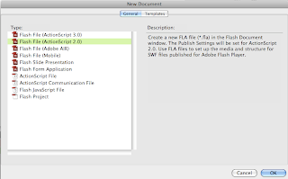
Press Adobe Flash CS4 at your dock
and it brings up the document (to the left)
press Flash File (ActionScript 2.0) (one thats highlighted)
This will bring up a plank page
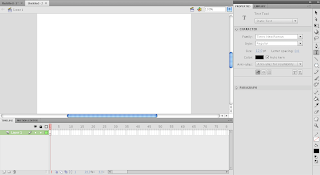
From this page you can see that it is very similar to Photoshop with the tool bar (The strip on the far right of the image)its also similar in the way as it holds everything in the library so each image, video, button has its own layer so you can have the erigenal image.
 Then pick a shape (i picked polystar tool) It will apear on the page, make it to the soze you want and change the colours

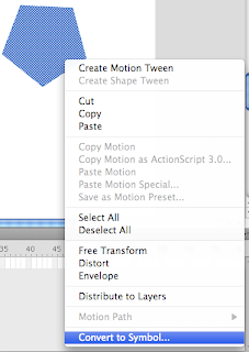
Press shift and then click (on the shape)
and go down to the bottom where it says convert to symbol...
and this will bring up a document
like the one below *
 *
*
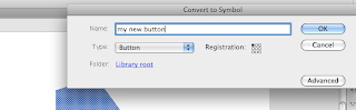
first name it something so you now what it is
(if its a home button name it home)
then click on the click down next to type
and select button like show in the image.
then press ok
 ok now we have set up our button but it needs text so click on the text button on the text strip, select it and then clip once where you want it on the button
 (hello!! used as an example) simply type and it will come out Times New Roman in black, to change it you have to -
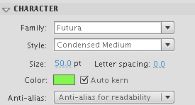
From the boring font above
if you change the family to a font that you like
change the size thats suitable
and then change the colour relevant
and this will change it to the image below
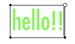
this is now it turned out once i added all the information above
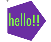
This is what it looks like if you add it to the shape
now you have set out the button but you need to properly create it in to a button my making it change
 with a button it has 4 changes, up which is its normal state on a web page, then you have over which is when you hovering over it, followed by down, which is when you click on the button its self and that changes slightly, and last of all is hit but that doe
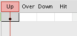 sn't change.
but to change the button each time you have to go though the process
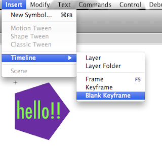
when you make it a button at the beginning that does the up but now we need to do the over so simply go Insert - timeline and then keyframe (not blank keyframe) and that will change it to over, so you can change it and do the same again for down (go Insert - timeline and then keyframe (not blank keyframe) and then change the colour
last time as when you do it again for hit but this time you do not change the colour, you keep it the same (go Insert - timeline and then keyframe (not blank keyframe)
this is what i came up with:
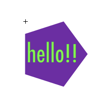
Up
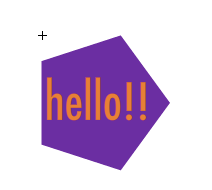
Over
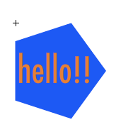
Down and Hit
and can i say it does achally work !
On the first day of starting the project every one was show how to do a web button on flash
i really struggled with this and redone this 4 times (not joking)
My step by step how to do a button

Press Adobe Flash CS4 at your dock
and it brings up the document (to the left)
press Flash File (ActionScript 2.0) (one thats highlighted)
This will bring up a plank page

From this page you can see that it is very similar to Photoshop with the tool bar (The strip on the far right of the image)its also similar in the way as it holds everything in the library so each image, video, button has its own layer so you can have the erigenal image.
 Then pick a shape (i picked polystar tool) It will apear on the page, make it to the soze you want and change the colours

Press shift and then click (on the shape)
and go down to the bottom where it says convert to symbol...
and this will bring up a document
like the one below *
 *
*first name it something so you now what it is
(if its a home button name it home)
then click on the click down next to type
and select button like show in the image.
then press ok
 ok now we have set up our button but it needs text so click on the text button on the text strip, select it and then clip once where you want it on the button
 (hello!! used as an example) simply type and it will come out Times New Roman in black, to change it you have to -
From the boring font above
if you change the family to a font that you like
change the size thats suitable
and then change the colour relevant
and this will change it to the image below

this is now it turned out once i added all the information above
This is what it looks like if you add it to the shape
now you have set out the button but you need to properly create it in to a button my making it change
 with a button it has 4 changes, up which is its normal state on a web page, then you have over which is when you hovering over it, followed by down, which is when you click on the button its self and that changes slightly, and last of all is hit but that doe
 sn't change.
but to change the button each time you have to go though the process

when you make it a button at the beginning that does the up but now we need to do the over so simply go Insert - timeline and then keyframe (not blank keyframe) and that will change it to over, so you can change it and do the same again for down (go Insert - timeline and then keyframe (not blank keyframe) and then change the colour
last time as when you do it again for hit but this time you do not change the colour, you keep it the same (go Insert - timeline and then keyframe (not blank keyframe)
this is what i came up with:

Up

Over

Down and Hit
and can i say it does achally work !
'The V&A museum!
One of my new projects is to create a poster as well as many other advertisements to promote 'The Victoria and Albert Museum. I am to design it in a way that it stands out to people of the age 11-19 years of age.
Before i start this project i would like to now more about 'The V&A', and before i go up and visit the museum on the 15th of January.
This is what i found out about the museum:
The Victoria and Albert Museum was first founded in 1852, following the enormous success of the Great Exhibition the previous year. profits from the Exhibition were used to establish the new institution, exhibits were purchased to form the basis of its collections and Henry Cole, one of the masterminds of the 1851 event.
The V&A turned out to be one of the greatest museums of decorative art in the world. Its collections of ceramics, glass, textiles, dress, silver, ironwork, jewellery furniture, sculpture, paintings, prints, and photographs span the culture of Europe, North America, Asia, and North Africa, times from ancient times to present day.
The Museum of manufactures, as it was initially called, aimed to make works of art available to inspire British designers and manufactures. The first home of Museum was in 1857 it moved to its present site and was renamed 'The South Kensington Museum. The Museum expanded rapidly and in 1899 Queen Victoria laid the foundation stone of a new building designed to give the Museum a grand facade. To mark the occasion it was renamed The Victoria and Albert Museum, in memory of the enthusiastic support Prince Albert gave to its foundation. The new building, by Aston Webb, was opened in 1909 and is today the familiar exterior of the Museum.
Throughout the 20th and into the 21st century the collects have continued to grow and the Museum has constantly sought new in the main entrance of the Museum. The V&A rotunda chandelier is by Dale Chihuly (b.1941), one of the most celebrated artists working in glass today. it is one of a series of such works begun in 1992. Based in Seattle, Chihuly draws on the historic techniques of the murano glass works Venice. He and his large team of assistants work in blown glass, in the most extravagant manner and richest of colours, to create dazzling sculptural statements.
Artists like Dale Chihuly and many others present there art work at the V&A!
The V&A website is http://www.vam.ac.uk/
This is the piece of art that hangs
in the front entrance by Dale Chahuly
Even from a small picture you can tell that this glass sculpture is truly amazing.
Before i start this project i would like to now more about 'The V&A', and before i go up and visit the museum on the 15th of January.
This is what i found out about the museum:
The Victoria and Albert Museum was first founded in 1852, following the enormous success of the Great Exhibition the previous year. profits from the Exhibition were used to establish the new institution, exhibits were purchased to form the basis of its collections and Henry Cole, one of the masterminds of the 1851 event.
The V&A turned out to be one of the greatest museums of decorative art in the world. Its collections of ceramics, glass, textiles, dress, silver, ironwork, jewellery furniture, sculpture, paintings, prints, and photographs span the culture of Europe, North America, Asia, and North Africa, times from ancient times to present day.
The Museum of manufactures, as it was initially called, aimed to make works of art available to inspire British designers and manufactures. The first home of Museum was in 1857 it moved to its present site and was renamed 'The South Kensington Museum. The Museum expanded rapidly and in 1899 Queen Victoria laid the foundation stone of a new building designed to give the Museum a grand facade. To mark the occasion it was renamed The Victoria and Albert Museum, in memory of the enthusiastic support Prince Albert gave to its foundation. The new building, by Aston Webb, was opened in 1909 and is today the familiar exterior of the Museum.
Throughout the 20th and into the 21st century the collects have continued to grow and the Museum has constantly sought new in the main entrance of the Museum. The V&A rotunda chandelier is by Dale Chihuly (b.1941), one of the most celebrated artists working in glass today. it is one of a series of such works begun in 1992. Based in Seattle, Chihuly draws on the historic techniques of the murano glass works Venice. He and his large team of assistants work in blown glass, in the most extravagant manner and richest of colours, to create dazzling sculptural statements.
Artists like Dale Chihuly and many others present there art work at the V&A!
The V&A website is http://www.vam.ac.uk/

This is the piece of art that hangs
in the front entrance by Dale Chahuly
Even from a small picture you can tell that this glass sculpture is truly amazing.
(information found on the website and in the
V&A, A Hundred Highlights, guide)
V&A, A Hundred Highlights, guide)
Monday, 4 January 2010
flash websiters
we where asked to look at different flash websites
this is one website that i found strange but strange but interesting
http://www.eatachiquita.com/#/home
its really enticing in the way that you can't stop watching u just want
to carry on watching the banana

even when
its loading i
couldn't stop
watching
This is another website that i found, its selling cars, its really
interesting the use of colours on this page is very well done as
its not over the top, it uses purples, blues and greens so its
opposite colours that go http://www.stickanddrive.com/

http://rabbids.uk.ubi.com/gohome/
This next website is created for children, its called 'rabbits
go home', when you you enter this website it it all jumps out
at you, its very bright and cartooned page, its got a very
animated rabbit that squeaks, its like its made a comic
book in 3D.

http://spectreperformance.com/#HOME
This website below called spectre performance, you can tell
straight away that this website it designed for young male, you
look at this page and it looks like the cars are racing, if u turn
the sound up when entering this page and you can hear cars reeving

WEB DESGIN
How the internet works!

Checking out file types
The one of the important this about my current project (web design)
Is the file types, knowing what all programs
JPEG
(pronounced jay-peg) is a commonly used method of compressing photographic images. The compression algorithm is "lossy" in that information is removed from the image to assist with decreasing the file size. The greater the compression, the more information is discarded. Files that have undergone jpeg compression usually have extensions such as .jfif, .jpeg, or jpg.
TIFF
Definition: One of the most commonly used and versatile graphics formats in desktop publishing, TIFF or Tagged Image File Format is a bitmap graphics format that is ideal for high resolution printing to PostScript printers and imagesetters. Originally created as a scanning format, TIFF offers great flexibility for use in page layout applications in part due to multiple color modes, multiple compression types, and cross-platform compatibility. TIFF images support both embedded paths and alpha channels which can be used to create transparent backgrounds for images in a page layout application. Bitmap graphics software such as Adobe Photoshop and Corel Photo-Paint can create and edit TIFF images.
GIF
short for Graphics Interchange Format is a file format for storing graphical images up to 256 colors. It uses LZW compression which is a lossless compression method. Until the year 2004, this was covered by a patent owned by Unisys and the reason why the PNG file graphic format was invented. There are two versions of GIF both created by Compuserve. The earlier GIF 87a and the enhanced 89a which stored multiple images (thus allowing animation), and interlacing. GIF files are probably the most popular on the web being used in logos and any color images with 256 or fewer colors. For images containing text GIF tends to be better than JPG because the files tend to be smaller and JPG files usually have some degree of compression and this can make text blurry.
DPF
Portable Document Format or PDF is a file format created by Adobe Systems, Inc. PDF uses the PostScript printer description language and is highly portable across computer platforms. PDF documents have a .pdf file extension (myfile.pdf) PSD
The .psd format is the Adobe Photoshop data format which can be read on any machine that has Adobe Photoshop installed. It is cross platform and can be used on both PCs and Macs. The PSD format provides extended support for layering, alpha channels, paths, and vectors. The PSD source file included with our templates are usually in a sliced format which allows you to customize and make changes to the images on your skin. This makes it very useful for customizing your website as you see fit. If any additional fonts are required, they are included with the Photoshop file.
FLA
Adobe Flash (formerly Macromedia Flash) is a multimedia platform originally acquired by Macromedia and currently developed and distributed by Adobe Systems. Since its introduction in 1996, Flash has become a popular method for adding animation and interactivity to web pages. Flash is commonly used to create animation, advertisements, and various web page Flash components, to integrate video into web pages, and more recently, to develop rich Internet applications.
HTML
HTML, which stands for Hyper Text Markup Language, is the predominant markup language for web pages. It provides a means to create structured documents by denoting structural semantics for text such as headings, paragraphs, lists etc as well as for links, quotes, and other items. It allows images and objects to be embedded and can be used to create interactive forms. It is written in the form of HTML elements consisting of "tags" surrounded by angle brackets within the web page content. It can include or can load scripts in languages such as JavaScript which affect the behavior of HTML processors like Web browsers; and Cascading Style Sheets (CSS) to define the appearance and layout of text and other material. The W3C, maintainer of both HTML and CSS standards, encourages the use of CSS over explicit presentational markup.
These are more file types
.acv - Adobe Photoshop compensation curve file.
.adp - Microsoft Access project file / Dynamic web page.
.ai - PostScript viewer / Acrobat Illustrator vector graphics file / AIwin project file.
.amv - Audio-Video media file.
.ani - Animated cursor file.
.as - Flash ActionScript file.
.bmc - Bitmap Cache file / Embroidery image file.
.bmp - Bit-map image file.
.btm - Batch to memory file.
.cdd - Claris Draw graphics file / CVI symbol table / CADEX drawing / ConceptDraw document / UML file.
.cdl - SignLab vector graphics file / Common Data Language file / CAD Advanced Design Language file.
.cdr - CorelDRAW drawing / Raw Audio-CD.
.DS_Store - Mac OS X file describing the appearance of a folder.
.dot - Microsoft Word template.
dotm - Microsoft Word 2007 template supporting macros.
.dotx - Microsoft Word 2007 template.
.fla - Flash movie file.
m4a - Apple Inc MPEG 4 file.
.mbm - MultiBitMap file.
.qxd - QuarkXPress document.
.qxp - QuarkXPress document.
.tmb - Thumbnail image file.
.wmf - Graphics file.
.wpp - Web Plus Project file / WordPerfect colour palette file / Web Part Package file.
.xhtml - XHTML web page

Checking out file types
The one of the important this about my current project (web design)
Is the file types, knowing what all programs
JPEG

(pronounced jay-peg) is a commonly used method of compressing photographic images. The compression algorithm is "lossy" in that information is removed from the image to assist with decreasing the file size. The greater the compression, the more information is discarded. Files that have undergone jpeg compression usually have extensions such as .jfif, .jpeg, or jpg.
TIFF
Definition: One of the most commonly used and versatile graphics formats in desktop publishing, TIFF or Tagged Image File Format is a bitmap graphics format that is ideal for high resolution printing to PostScript printers and imagesetters. Originally created as a scanning format, TIFF offers great flexibility for use in page layout applications in part due to multiple color modes, multiple compression types, and cross-platform compatibility. TIFF images support both embedded paths and alpha channels which can be used to create transparent backgrounds for images in a page layout application. Bitmap graphics software such as Adobe Photoshop and Corel Photo-Paint can create and edit TIFF images.
GIF
short for Graphics Interchange Format is a file format for storing graphical images up to 256 colors. It uses LZW compression which is a lossless compression method. Until the year 2004, this was covered by a patent owned by Unisys and the reason why the PNG file graphic format was invented. There are two versions of GIF both created by Compuserve. The earlier GIF 87a and the enhanced 89a which stored multiple images (thus allowing animation), and interlacing. GIF files are probably the most popular on the web being used in logos and any color images with 256 or fewer colors. For images containing text GIF tends to be better than JPG because the files tend to be smaller and JPG files usually have some degree of compression and this can make text blurry.
DPF
Portable Document Format or PDF is a file format created by Adobe Systems, Inc. PDF uses the PostScript printer description language and is highly portable across computer platforms. PDF documents have a .pdf file extension (myfile.pdf) PSD
The .psd format is the Adobe Photoshop data format which can be read on any machine that has Adobe Photoshop installed. It is cross platform and can be used on both PCs and Macs. The PSD format provides extended support for layering, alpha channels, paths, and vectors. The PSD source file included with our templates are usually in a sliced format which allows you to customize and make changes to the images on your skin. This makes it very useful for customizing your website as you see fit. If any additional fonts are required, they are included with the Photoshop file.
FLA
Adobe Flash (formerly Macromedia Flash) is a multimedia platform originally acquired by Macromedia and currently developed and distributed by Adobe Systems. Since its introduction in 1996, Flash has become a popular method for adding animation and interactivity to web pages. Flash is commonly used to create animation, advertisements, and various web page Flash components, to integrate video into web pages, and more recently, to develop rich Internet applications.
HTML

HTML, which stands for Hyper Text Markup Language, is the predominant markup language for web pages. It provides a means to create structured documents by denoting structural semantics for text such as headings, paragraphs, lists etc as well as for links, quotes, and other items. It allows images and objects to be embedded and can be used to create interactive forms. It is written in the form of HTML elements consisting of "tags" surrounded by angle brackets within the web page content. It can include or can load scripts in languages such as JavaScript which affect the behavior of HTML processors like Web browsers; and Cascading Style Sheets (CSS) to define the appearance and layout of text and other material. The W3C, maintainer of both HTML and CSS standards, encourages the use of CSS over explicit presentational markup.
Cascading Style Sheets
(CSS) is a style sheet language used to describe the presentation semantics (that is, the look and formatting) of a document written in a markup language. Its most common application is to style web pages written in HTML and XHTML, but the language can be applied to any kind of XML document, including SVG and XUL.
CSS is designed primarily to enable the separation of document content (written in HTML or a similar markup language) from document presentation, including elements such as the layout, colors, and fonts. This separation can improve content accessibility, provide more flexibility and control in the specification of presentation characteristics, enable multiple pages to share formatting, and reduce complexity and repetition in the structural content (such as by allowing for tableless web design). CSS can also allow the same markup page to be presented in different styles for different rendering methods, such as on-screen, in print, by voice (when read out by a speech-based browser or screen reader) and on Braille-based, tactile devices. While the author of a document typically links that document to a CSS style sheet, readers can use a different style sheet, perhaps one on their own computer, to override the one the author has specified.
CSS specifies a priority scheme to determine which style rules apply if more than one rule matches against a particular element. In this so-called cascade, priorities or weights are calculated and assigned to rules, so that the results are predictable.
These are more file types
.acv - Adobe Photoshop compensation curve file.
.adp - Microsoft Access project file / Dynamic web page.
.ai - PostScript viewer / Acrobat Illustrator vector graphics file / AIwin project file.
.amv - Audio-Video media file.
.ani - Animated cursor file.
.as - Flash ActionScript file.
.bmc - Bitmap Cache file / Embroidery image file.
.bmp - Bit-map image file.
.btm - Batch to memory file.
.cdd - Claris Draw graphics file / CVI symbol table / CADEX drawing / ConceptDraw document / UML file.
.cdl - SignLab vector graphics file / Common Data Language file / CAD Advanced Design Language file.
.cdr - CorelDRAW drawing / Raw Audio-CD.
.DS_Store - Mac OS X file describing the appearance of a folder.
.dot - Microsoft Word template.
dotm - Microsoft Word 2007 template supporting macros.
.dotx - Microsoft Word 2007 template.
.fla - Flash movie file.
m4a - Apple Inc MPEG 4 file.
.mbm - MultiBitMap file.
.qxd - QuarkXPress document.
.qxp - QuarkXPress document.
.tmb - Thumbnail image file.
.wmf - Graphics file.
.wpp - Web Plus Project file / WordPerfect colour palette file / Web Part Package file.
.xhtml - XHTML web page
Wednesday, 30 December 2009
The HND Course Graphic Design
I have resonantly found the picture to the HND
course for Graphic Design, (last years students)
when i viewed the exhibition which was presented
by the student on the HND Course while i was looking
at there final outcomes, you could really see the
designs they had come up with where extraordinary,
they had designs things that where based from a
design and yet they are on a 3D object like trainers.
These are some of the student work that really
interested me
IMAGE ABOVE
This is a poster advertising Wagamama's,
which are basically clean, fresh chines food
cooked then and there.when I look at this
poster it makes it look friesh and exsiting
I really like the wave are designed full of
lines with different of blues, its got that
ethnic feel to it in the design as well as
making it looking different and unique

IMAGE ABOVE
These simple plimsales are really
made affective with the simple
yet complicated hand designed
pen drawing, the plimsales are a
final i think is a brilliant design,
i really think people would love
this design and would buy them.
ITS FRESH AND INVENTIVE
MY FAVOURITE

IMAGE ABOVE AND BELOW
These 2 final outcomes are from the same artist,
i really like the outcomes, i like the drawings that
are different, they remind me of the animated film '
Robots' in the style they are drawn and with the
colours they use.

IMAGE BELOW
I really like this 70's - 80'sfont design using
fecords, with the look of the records
of the design on the typefaces it makes it
look aged, like it was designed in the past

The Exhibition was a grate success for me in
a way it proved to me that u don't have to
just design posters and book covers you can also
design designs for 3D objects as well,
its also tout me that old can be new and that its
how you present your outcomes that
makes it look profetional and stylalized.
course for Graphic Design, (last years students)
when i viewed the exhibition which was presented
by the student on the HND Course while i was looking
at there final outcomes, you could really see the
designs they had come up with where extraordinary,
they had designs things that where based from a
design and yet they are on a 3D object like trainers.
These are some of the student work that really
interested me

IMAGE ABOVE
This is a poster advertising Wagamama's,
which are basically clean, fresh chines food
cooked then and there.when I look at this
poster it makes it look friesh and exsiting
I really like the wave are designed full of
lines with different of blues, its got that
ethnic feel to it in the design as well as
making it looking different and unique

IMAGE ABOVE
These simple plimsales are really
made affective with the simple
yet complicated hand designed
pen drawing, the plimsales are a
final i think is a brilliant design,
i really think people would love
this design and would buy them.
ITS FRESH AND INVENTIVE
MY FAVOURITE

IMAGE ABOVE AND BELOW
These 2 final outcomes are from the same artist,
i really like the outcomes, i like the drawings that
are different, they remind me of the animated film '
Robots' in the style they are drawn and with the
colours they use.

IMAGE BELOW
I really like this 70's - 80'sfont design using
fecords, with the look of the records
of the design on the typefaces it makes it
look aged, like it was designed in the past

The Exhibition was a grate success for me in
a way it proved to me that u don't have to
just design posters and book covers you can also
design designs for 3D objects as well,
its also tout me that old can be new and that its
how you present your outcomes that
makes it look profetional and stylalized.
Tuesday, 8 December 2009
!950's website finding
As I’m studying the 1950’s I did a search on Google. I found a website that shows me everything about the 1950’s, its about outfits mainly, showing loads of different 50’s clothes things like bowling tops, but for the 50’s they had classic, retro, longemaster and swingmaster as well as the traditional t-shirt. There are also plenty of other bits about the 50’s, Hollywood legends, party goods, 50’s diner and drive in with plenty of others.
This website had really helped me with my packaging project, it has show me the basic style of American 50’s!
http://images.google.co.uk/imgres?imgurl=http://www.bowlingshirt.com/images/bombshells/bombshell16_lg.jpg&imgrefurl=http://www.bowlingshirt.com/closeouts/apparel/%3Fproductid%3D189&usg=__rr-h4W2bnJ71eKsnqOoSErnvd5Q=&h=1224&w=750&sz=152&hl=en&start=2&um=1&tbnid=YSxk0PE-ePyNPM:&tbnh=150&tbnw=92&prev=/images%3Fq%3Dpin%2Bup%2Bgirls%26hl%3Den%26safe%3Dactive%26sa%3DG%26um%3D1
This website had really helped me with my packaging project, it has show me the basic style of American 50’s!
http://images.google.co.uk/imgres?imgurl=http://www.bowlingshirt.com/images/bombshells/bombshell16_lg.jpg&imgrefurl=http://www.bowlingshirt.com/closeouts/apparel/%3Fproductid%3D189&usg=__rr-h4W2bnJ71eKsnqOoSErnvd5Q=&h=1224&w=750&sz=152&hl=en&start=2&um=1&tbnid=YSxk0PE-ePyNPM:&tbnh=150&tbnw=92&prev=/images%3Fq%3Dpin%2Bup%2Bgirls%26hl%3Den%26safe%3Dactive%26sa%3DG%26um%3D1


Monday, 7 December 2009
latest essay
please read my essay and let me now how i could improve it ! (pics coming soon)
Paul Rand
Paul Rand (Peretz Rosenbaum) was born in Brooklyn, New York in August the 14 1914, he was a Graphic designer that was best known for his corporate logo designs.
He got in to design at a very young age, painting signs for his father’s grocery store as well as for school events. Rand’s father did not believe art could provide his son with a sufficient livelihood, and so he required Paul to attend Manhattan’s Harren High School while taking night classes at the Pratt Institute, Rand was by-and-large “self-taught as a designer, learning about the works of Cassandre and Moholy-Nagy from European magazines such as Gebrauchsgraphik.”
His career began with humble assignments, starting with a part-time position creating stock images for a syndicate that supplied graphics to various newspapers and magazines. Between his class assignments and his work, Rand was able to amass a fairly large portfolio, largely influenced by the German advertising style Sachplakat (object poster) as well as the works of Gustav Jensen. It was around this time that he decided to camouflage and abbreviate the overtly Jewish identity telegraphed by ‘Peretz Rosenbaum,’ shortening his forename to ‘Paul’ and taking ‘Rand’ from an uncle to form his new surname. Morris Wyszogrod, a friend and associate of Rand, noted that “he figured that ‘Paul Rand,’ four letters here, four letters there, would create a nice symbol. So he became Paul Rand." Roy R. Behrens notes the importance of this new title: “Rand’s new persona, which served as the brand name for his many accomplishments, was the first corporate identity he created, and it may also eventually prove to be the most enduring."Indeed, Rand was rapidly moving into the forefront of his profession. In his early twenties he was producing work that began to garner international acclaim, notably his designs on the covers of Direction magazine, which Rand produced for no fee in exchange for full artistic freedom. Among the accolades Rand received were those of Laszlo Moholy-Nagy:
The reputation Rand so rapidly amassed in his prodigious twenties never dissipated; rather, it only managed to increase through the years as the designer’s influential works and writings firmly established him as the éminence grise of his profession.
Although Rand was most famous for the corporate logos he created in the 1950s and 1960s, his early work in page design was the initial source of his reputation. In 1936, Rand was given the job of setting the page layout for an Apparel Arts magazine anniversary issue. “His remarkable talent for
transforming mundane photographs into dynamic compositions, which gave editorial weight to the page” earned Rand a full-time job, as well as an offer to take over as art director for the Esquire-Coronet magazines. Initially, Rand refused this offer, claiming that he was not yet at the level the job required, but a year later he decided to go ahead with it, taking over responsibility for Esquire’s fashion pages at the young age of twenty-three.
The cover art for Direction magazine proved to be an important step in the development of the “Paul Rand look” that was not as yet fully developed. The December 1940 cover, which uses barbed wire to present the magazine as both a war-torn gift and a crucifix, is indicative of the artistic freedom Rand enjoyed at Direction; in Thoughts on Design Rand notes that it “is significant that the crucifix, aside from its religious implications, is a demonstration of pure plastic form as well a perfect union of the aggressive vertical (male) and the passive horizontal (female)." In ways such as this, Rand was experimenting with the introduction of themes normally found in the “high arts” into his new graphic design, further advancing his life-long goal of bridging the gap between his profession and that of Europe’s modernist.
The IBM was another Logo that Rand designed, it was the one that made him very famous for. The first design was the normal IBM logo and he was asked to improve it.
(http://www.youtube.com/watch?v=Ta4ef1xBeMA)
The final out come is the bottom picture, you can see with the 3 IBM logos that the bottom one stands out more than the rest, what Paul Rand simply did was to reduce the 13 blue lines to 8, where its more blue it stands out more and there for stands out more to people. looking at the logos you can really see the changes but in todays design, it wouldn’t stand out with the bright coloured, heavy designs we have today. the first IBM logo was designed in 1956, when you look at the design below you can see there is a big difference between the 2 and thats Paul Rand’s design and then he improved it more by making it stand out more, changing the 13 blue lines to 8 blue lines.
Another logo he redesigned was the Harcourt brace and Company in 1957, Witch is a company that sells fiction and nonfiction books to adults and children. This logo is very simple but affective for the era, in this time there technology was not as advance as now, so things would of been simple, if you look at the design now you can see how the logo had changed and how technology has changed and improved, because of this the designs have got random and wacky.
This logo that Paul Rand also designed was colorforms in 1959, witch is a company that designs “paper toys” they describe the toys to be “sheet images and shapes that can be applied to a slick cardboard background board, much like placing paper dolls against a paper backdrop” so when you look at the logo (right image) you can tell where he got his idea from when you look at the toys (left image). this logo looks really inventive and it really suits the age rang, its also got really bright colours that would shout if it was in a shop window or on the wall.
United percale service (UPS)1961, This packaging delivery company logo that Rand designed, as you can see the design is very simple, its gone for a shield shape, its got a bow on top, shouting that its a packaging company, its also very plain saying that it would of been an early company just starting, with not a lot of money. where you look at the current logo, you can see that its more presentable and even looks 3D , the colours also stand out but still using the brown colours from the brown packaging colours, you can also see that they have changed the type face to something bolder.
The American Broadcasting corporation (abc) 1962, the bigger logo is the logo designed in 1962 by Paul Rand. This simple logo is really affective i like the way the font fits in with the roundness of the circle, you can also see where they have improved it (smaller image) they basically have made it 3D and shinny, i actually prefer it as it was before, i like the simple look it looks like the letters have been cut out and your left with a stencil.
i think the current logo (smaller image) is slightly over worked with the lighting, they have tried to add shading and reflections in the design to make the design come to
live and look 3D
NeXT computer, Rand designed this logo in 1986, this logo was created for a for a computer company, i rally like the 3D affect with this design, i like the bright colours in the text i also like the simple font its very affective. This logo is the only one that hasn’t been improved to another logo, this logo has stayed the same since it was designed in 1986.
Hub TV, 1995, looking at this logo, i really don’t no what paul rand was trying to come up with, i like the type face but that its it, i think the was he has put it in a random circle and random colour for the text is very unprofessional.
The NeXT computer logo and Hub TV both of these 2 are very similar you can see that in between the time of this logos (9 years) they are very similar and Paul Rand must of hit a point where he liked this style.
When you get to his final piece of work you can see that his style changes and he goes back to dull colours
Doug Evans + partners, this was the last one designed before he died in 1996 of cancer, i really like the was its in another letter, looking at this one i think this is the most advance graphical one out of all of them, the way the words curve round with the ‘E’ i also like the colours but they might be a bit dark.
Paul didn’t just design logos for companies he also design posters, packaging, books, advertising and many more! http://www.paul-rand.com/gallery.shtml
you can really see from his website that he was interested in his work and believed in it, i think for him to do graphic design was more like a hobby rather than a job, his work was based on illustration and graphics so he also experimented. i also looked on youtube about him, he was a man that new all about graphics and it was sad to read that he died of cancer in 1996
He is buried in Beth El Cemetery in Norwalk, Connecticut.
The main wesites i looked at where
http://www.paul-rand.com/gallery.shtml
http://www.paul-rand.com/gallery.shtml
http://www.logodesignlove.com/all-about-paul-rand
http://www.logodesignlove.com/all-about-paul-rand
Paul Rand
Paul Rand (Peretz Rosenbaum) was born in Brooklyn, New York in August the 14 1914, he was a Graphic designer that was best known for his corporate logo designs.
He got in to design at a very young age, painting signs for his father’s grocery store as well as for school events. Rand’s father did not believe art could provide his son with a sufficient livelihood, and so he required Paul to attend Manhattan’s Harren High School while taking night classes at the Pratt Institute, Rand was by-and-large “self-taught as a designer, learning about the works of Cassandre and Moholy-Nagy from European magazines such as Gebrauchsgraphik.”
His career began with humble assignments, starting with a part-time position creating stock images for a syndicate that supplied graphics to various newspapers and magazines. Between his class assignments and his work, Rand was able to amass a fairly large portfolio, largely influenced by the German advertising style Sachplakat (object poster) as well as the works of Gustav Jensen. It was around this time that he decided to camouflage and abbreviate the overtly Jewish identity telegraphed by ‘Peretz Rosenbaum,’ shortening his forename to ‘Paul’ and taking ‘Rand’ from an uncle to form his new surname. Morris Wyszogrod, a friend and associate of Rand, noted that “he figured that ‘Paul Rand,’ four letters here, four letters there, would create a nice symbol. So he became Paul Rand." Roy R. Behrens notes the importance of this new title: “Rand’s new persona, which served as the brand name for his many accomplishments, was the first corporate identity he created, and it may also eventually prove to be the most enduring."Indeed, Rand was rapidly moving into the forefront of his profession. In his early twenties he was producing work that began to garner international acclaim, notably his designs on the covers of Direction magazine, which Rand produced for no fee in exchange for full artistic freedom. Among the accolades Rand received were those of Laszlo Moholy-Nagy:
The reputation Rand so rapidly amassed in his prodigious twenties never dissipated; rather, it only managed to increase through the years as the designer’s influential works and writings firmly established him as the éminence grise of his profession.
Although Rand was most famous for the corporate logos he created in the 1950s and 1960s, his early work in page design was the initial source of his reputation. In 1936, Rand was given the job of setting the page layout for an Apparel Arts magazine anniversary issue. “His remarkable talent for
transforming mundane photographs into dynamic compositions, which gave editorial weight to the page” earned Rand a full-time job, as well as an offer to take over as art director for the Esquire-Coronet magazines. Initially, Rand refused this offer, claiming that he was not yet at the level the job required, but a year later he decided to go ahead with it, taking over responsibility for Esquire’s fashion pages at the young age of twenty-three.
The cover art for Direction magazine proved to be an important step in the development of the “Paul Rand look” that was not as yet fully developed. The December 1940 cover, which uses barbed wire to present the magazine as both a war-torn gift and a crucifix, is indicative of the artistic freedom Rand enjoyed at Direction; in Thoughts on Design Rand notes that it “is significant that the crucifix, aside from its religious implications, is a demonstration of pure plastic form as well a perfect union of the aggressive vertical (male) and the passive horizontal (female)." In ways such as this, Rand was experimenting with the introduction of themes normally found in the “high arts” into his new graphic design, further advancing his life-long goal of bridging the gap between his profession and that of Europe’s modernist.
The IBM was another Logo that Rand designed, it was the one that made him very famous for. The first design was the normal IBM logo and he was asked to improve it.
(http://www.youtube.com/watch?v=Ta4ef1xBeMA)
The final out come is the bottom picture, you can see with the 3 IBM logos that the bottom one stands out more than the rest, what Paul Rand simply did was to reduce the 13 blue lines to 8, where its more blue it stands out more and there for stands out more to people. looking at the logos you can really see the changes but in todays design, it wouldn’t stand out with the bright coloured, heavy designs we have today. the first IBM logo was designed in 1956, when you look at the design below you can see there is a big difference between the 2 and thats Paul Rand’s design and then he improved it more by making it stand out more, changing the 13 blue lines to 8 blue lines.
Another logo he redesigned was the Harcourt brace and Company in 1957, Witch is a company that sells fiction and nonfiction books to adults and children. This logo is very simple but affective for the era, in this time there technology was not as advance as now, so things would of been simple, if you look at the design now you can see how the logo had changed and how technology has changed and improved, because of this the designs have got random and wacky.
This logo that Paul Rand also designed was colorforms in 1959, witch is a company that designs “paper toys” they describe the toys to be “sheet images and shapes that can be applied to a slick cardboard background board, much like placing paper dolls against a paper backdrop” so when you look at the logo (right image) you can tell where he got his idea from when you look at the toys (left image). this logo looks really inventive and it really suits the age rang, its also got really bright colours that would shout if it was in a shop window or on the wall.
United percale service (UPS)1961, This packaging delivery company logo that Rand designed, as you can see the design is very simple, its gone for a shield shape, its got a bow on top, shouting that its a packaging company, its also very plain saying that it would of been an early company just starting, with not a lot of money. where you look at the current logo, you can see that its more presentable and even looks 3D , the colours also stand out but still using the brown colours from the brown packaging colours, you can also see that they have changed the type face to something bolder.
The American Broadcasting corporation (abc) 1962, the bigger logo is the logo designed in 1962 by Paul Rand. This simple logo is really affective i like the way the font fits in with the roundness of the circle, you can also see where they have improved it (smaller image) they basically have made it 3D and shinny, i actually prefer it as it was before, i like the simple look it looks like the letters have been cut out and your left with a stencil.
i think the current logo (smaller image) is slightly over worked with the lighting, they have tried to add shading and reflections in the design to make the design come to
live and look 3D
NeXT computer, Rand designed this logo in 1986, this logo was created for a for a computer company, i rally like the 3D affect with this design, i like the bright colours in the text i also like the simple font its very affective. This logo is the only one that hasn’t been improved to another logo, this logo has stayed the same since it was designed in 1986.
Hub TV, 1995, looking at this logo, i really don’t no what paul rand was trying to come up with, i like the type face but that its it, i think the was he has put it in a random circle and random colour for the text is very unprofessional.
The NeXT computer logo and Hub TV both of these 2 are very similar you can see that in between the time of this logos (9 years) they are very similar and Paul Rand must of hit a point where he liked this style.
When you get to his final piece of work you can see that his style changes and he goes back to dull colours
Doug Evans + partners, this was the last one designed before he died in 1996 of cancer, i really like the was its in another letter, looking at this one i think this is the most advance graphical one out of all of them, the way the words curve round with the ‘E’ i also like the colours but they might be a bit dark.
Paul didn’t just design logos for companies he also design posters, packaging, books, advertising and many more! http://www.paul-rand.com/gallery.shtml
you can really see from his website that he was interested in his work and believed in it, i think for him to do graphic design was more like a hobby rather than a job, his work was based on illustration and graphics so he also experimented. i also looked on youtube about him, he was a man that new all about graphics and it was sad to read that he died of cancer in 1996
He is buried in Beth El Cemetery in Norwalk, Connecticut.
The main wesites i looked at where
http://www.paul-rand.com/gallery.shtml
http://www.paul-rand.com/gallery.shtml
http://www.logodesignlove.com/all-about-paul-rand
http://www.logodesignlove.com/all-about-paul-rand
Tuesday, 1 December 2009
Packaging project
when i started this project i thought it would easy as we where choosing our own product to redesign, choosing KRISPY KREMES wasn't a good idea as i havn't got a clue on how to re design it but i will have a go...
i have so far done all my research in to the company and the packaging side of things, I've also looked in to the history, of both KRISPY KREMES and packaging, aswell as recycling as it requires it in the brief.
my next step is to look at artists, i was thinking that becuase of KRISPY KREMES being basted about the 1950 (diner style) so i have desided to look at Rockwell, very detailed and very talanted man, he shows people in reality but makes it funny in a way, when u look at his paintings, all of the charicters eyes have so much caricture and feel.
You look at the packaging for KRISPY KREMES and you can also see that all of the packaging is dots, there is only one artist that does dots in his work and that is roy lichtenstein, im going to study his work and perhaps design the KRISPY KREME packaging on his work
(more coming soon)
i have so far done all my research in to the company and the packaging side of things, I've also looked in to the history, of both KRISPY KREMES and packaging, aswell as recycling as it requires it in the brief.
my next step is to look at artists, i was thinking that becuase of KRISPY KREMES being basted about the 1950 (diner style) so i have desided to look at Rockwell, very detailed and very talanted man, he shows people in reality but makes it funny in a way, when u look at his paintings, all of the charicters eyes have so much caricture and feel.
You look at the packaging for KRISPY KREMES and you can also see that all of the packaging is dots, there is only one artist that does dots in his work and that is roy lichtenstein, im going to study his work and perhaps design the KRISPY KREME packaging on his work
(more coming soon)
Monday, 16 November 2009
packaging project
KRISPY KREME
My packaging project is about re-designing the packaging for Krispy Kreme Doughnuts
On the 14/11/09 i went up to Bluewater to visit the Krispy Kreme shop
They had loads of different types of of Doughnuts


 these are pictures of the doughnuts all in the box
My packaging project is about re-designing the packaging for Krispy Kreme Doughnuts
On the 14/11/09 i went up to Bluewater to visit the Krispy Kreme shop
They had loads of different types of of Doughnuts


 these are pictures of the doughnuts all in the box
Monday, 19 October 2009
Faversham Carnival
ON THE 17TH OF OCTOBER IN FAVERSHAM, IT WAS THE FAVERSHAM FAIR 
ME AND THE BROWNIES WHERE JOINED IN, I DESIGNED AND MADE THE FLOT FOR OUR BROWNIES OUR THEME WAS PIRATES SO I DESIGNED A PIRATE SHIP,I USED A BASIC BOAT SHAPE OUT OF WOOD AND WAS PAINTED BROWN, I THEN USING OLD TESCO BANNERS WHICK WAS WHITE ON THE BACK, WAS PLACED ROUND THE OUTSIDE OF THE BOAT.
WE ALSO HAD SOME SPARE WHITE MATIRAL SO THAT WAS USED AS THE SAIL WHICH HAS ONE OF MY OWN OLD TEDDY BEARS OVER ALL THE BOAT WAS A GRATE SUCCESSE, SEP EVERY ONE LOOKED AT OUR BOAT AND SAID WOOOW ITS SO CALL AND THEN SAID 'EVERY LITTLE HELPS', WHICH THEY READ FROM THE TESCO BANNERS 


Monday, 12 October 2009
Typography
i have designed different typefaces for my typography project.
i had designed loads of different fonts, from just drawing then by hand with pencil pen and other materials, I've also gone on illustrator and designed fonts by computer where i have a font and then i create an out line around the text which allows me to to edit the font.
i have just tried creating a font using objects, the class as a howl, we all chose different objects
i chose Comdoms simply becuase no one else did and i though it would be a good idea to make type out of Comdoms, when it came to doing the type it was a lot harder, becuase i couldn't get the right shape out of it. But once i had sone them i made them black and white whick made it easyer because it didn't shout out what they where but it made it fight in with the book sex and typography.
IMAGE COMING SOON!
i had designed loads of different fonts, from just drawing then by hand with pencil pen and other materials, I've also gone on illustrator and designed fonts by computer where i have a font and then i create an out line around the text which allows me to to edit the font.
i have just tried creating a font using objects, the class as a howl, we all chose different objects
i chose Comdoms simply becuase no one else did and i though it would be a good idea to make type out of Comdoms, when it came to doing the type it was a lot harder, becuase i couldn't get the right shape out of it. But once i had sone them i made them black and white whick made it easyer because it didn't shout out what they where but it made it fight in with the book sex and typography.
IMAGE COMING SOON!
Subscribe to:
Posts (Atom)