Thursday, 12 January 2012

final Idea


After experimenting with this quote "be dirty" i have really fell in love with the artwork of , David Carson. Mainly one picture (Image show below) There is something about this image that i find so interesting, It is designed to make a purpose, with the negative space you are forced to look at the type, there is just enough to keep u looking and interested.
Without looking at the type and what it says. The black and white look, i feel like i have to look at it, i love the way you can't quite read the background yet you don't need to, because you know what it says.

Looking at David Carson's work, i have come up with my own idea within his. i really wanted to make mine over the top, to much, but still with the negative space left in. but just not so much that the negative space take over the type Once it was all laid out how i wanted and what looked best, i had to finalised the place of the the white font "BE DIRTY" Ideally i want it in a place where they have to look for it, but not to much, so i have tried out a few places where it could work and then asked peoples opinion!

Bottom Right
Top RightCentered Bottom Left

After everyones opinion, most peoples say they liked the bottom right because of the flow of the design and because its not the first thing you look at, you left guessing till you find it looking at my design, and listening to the opinions, and found that i agree with that they said
i think i also like it because some of the type in the background is left readable and and bigger than the white font, in some ways makes it stand out more, so don't have to look at the white font first to understand what its saying.
I like the way i have left it open for opinion, whether u think "be dirty" in a flirty, playful way or in a "Be Dirty" messy way


how you take the "Be Dirty" quote is up to you !

Monday, 9 January 2012

be dirty - image ideas using type

i wanted to come up with some ideas that was dirty, this is what i came up with
these are also images so im not sure if im aloud to use them, but there good ideas

first ideas for final project -4

i started of thinking about what sort of fonts 'be dirty' relates to which immediately thought of dirty dancing film and the type they have used for the front cover, i found a font that imaged it and had a go, with what i could do with it


then changing the type as i felt it didn't work, to Helvetica (When i first got the quote i really wanted to write, "Be Dirty ..... use HELVETICA" but then soon found out we wasn't aloud to add anything else to the quote, i still might do my own spin off)


i found it hard to choose between the font, layout, size and the colours, i think i need to take another approach to this project

David Carson Ideas 10/1/12

i have found so far, the quote 'Be Dirty' very hard to get ideas for, everything i try isn't really working the way that i won't it to, but came across my essay notes and saw David Carson and thought i would try it out


after developing these designs, i found one that really works, i'm going to try and improve this one slightly and try and get it printed A1 for my final

Task 4 type project

Task 4 - for this project we was asked to just place type in a box (only using black and white)
i came up with a range of ideas but they all seamed boring or not interesting because of the boring type

i got the ides of having negative space around the outside, but i wanted people to look at something


i tried putting them all together but then it looked like a list which is what i wanted to avoid
i wanted to distal the type make it look fun so i tried putting diagonally
or changing the way the list was looked at making the text look a lot more bulkier
but some how i love the side angle affect so i'm trying to change it more
my final outcome
i found i was draw toward the corner, and it had to be the bottom left corner, so after playing with the type and making it all fit in perfectly. once i had finished placing i didn't want to move it, i fell in love with the layout and didn't want to change it
im happy with this outcome!

Wednesday, 7 December 2011

project 3

i have to try and make this font visually interesting, using this font and only black and white font
as well as it all having to be the same size font, in a 15 by 15cm square
this isn't going to be easy at all!

Thursday, 1 December 2011

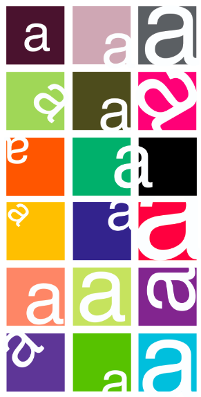
Taking the Helvetica 'a', our new project is to place the 'a' in a 150mm (15 cm) box
we have to make it visually appealing within the box these are design ideas

Monday, 28 November 2011

New Project -type!

2 typefaces everyone can read!
the 2 i have picked are not plan as i wanted to
show that serif fonts can be legable

Very old fashioned looking , for a serif font,
it is legable and readable, the serifs don’t distal the
typeface like some do!
Its a legable font that i have found is
eligant, and readalbe adding a serif works for this font
making it indivigual and visualy interesting


2 typefaces that can be made big !
these 2 are simple and affective, sanserif fonts
making them uncomplicated to make excremly big !

“Best type-face ever designed”, legable and clear
and uncomplicated! My saying “bad typefaces are everywhere but
good type faces are hidden and are often simple” !
( I love the helvetica video )
Simple typeface, again the simpleness has
made it really affective and legable, perfect for being made big!

Sunday, 20 November 2011

Final Cubism Wall


Final Cubism Wall- although it has changed a lot over the last couple of weeks im glad that its pulled through and came up good (although there are a few changes i would make for next time) im glad in the end we worked as a team and got it done as a group !

FINAL OUTCOME


Final outcome - im very happy with the final outcome, i think it capture the things i set out to design, music and cubism, making it and interesting piece to look at as well as a nice design

just to prove that i haven't gone over the size limitations