Sunday, 5 February 2012

Elective : Animation


I have come up with one idea where i do a plan stop motion (black and white) patten design just using a simple pattern affect and watch it grow


Maybe starting it off with something like, "Tell me about your self, using pen"


and just have at the end saying "I'm complicated "

Elective : Animation

I am interested in the different techniques of animation i really want to try a bit of everything, some are not very populate as others but if i try a bit of everything then i can not go wrong on my experimentation

i have to say the only one i have tried so far and not really enjoyed was green screen, although the outcome looks amazing, the lighting set up and the camera, along with the movement of the people is such a long process, i got bored easily and found it hard to concentrate, i will still keep it in mind if it is relevant to my project i will try my best to have a go but no promises !

Boiling animation, (where u have a picture or a film and u single handle draw over each frame to create a more sketchy effect animation) i could do this on any of my animations, using my graphics tablet, making quick and easy (to a point)

I have found that Stop Motion is very popular, and one of them most easy things to do, simply changing the frame slightly each time and u got ur self an animation, EASY!
(i found this one of YouTube and it just made me smile, its really simple but funny and effective)
http://www.youtube.com/watch?v=yoOn0LDHafo&feature=related

As well as, Time Lapse animation, i have also found this quite fun, experimenting on my way to work, just grabbing myself some ideas, (although my ideas are not strong as there either not relevant or not a strong outcome (picture wise) but the ideas are still there processing


over all i would like to do an animation the is more hand crafted, still with photography, but more handcrafted too, i would to avoid film if possible as im not really interested but i do find the stop motion interesting, after doing my first Time Lapse i might find a way of incorporating that too, as well as a bit of boiling will spice it up
i just need to find a subject ??????

..........
After doing some thinking ........ and still struggling, does it have to be relevant, does it have to mean anything, does it really have to have a narrative, if so then i can still make it simple, it would be easier if i could find a subject to animate that i would love to do, instead of something boring ????

Thursday, 2 February 2012

Elective : Animation, Techniques

"Boiling" this is the shimmering effect in hand drawn animation where lines are copied over and over in a sequence of drawings. Originally due just to the mechanics of trying and failing to copy lines exactly by hand, it is sometimes introduced deliberately as a stylistic feature in computer generated animation - random fluctuations in line quality may make the animation look hand drawn

"Rotoscoping" is an animation technique in which animators trace over live-action film movement, frameby frame, for use in animated films. Originally, recorded live-action film images were projected onto a frosted glass panel and re-drawn by an animator. This projection equipment is called a rotoscope, although this device has been replaced by computer in recent years. In the visual effects industry, the term rotoscoping refers to the technique of manually creating a matte for an element on a live-action plate so it may be composited over another background.


"Green screen" technology is the basis of the effects seen in everything from the latest Hollywood blockbusters to the weather forecast. The idea is simple. If you shoot a video with a single coloured backdrop (blue or green is often used) Pinnacle Studio allows you to make that colour transparent - replacing it with any other video clip, graphic or still image.


"Time-lapse" photography is a cinematography technique whereby the frequency at which film frames are captured (the frame rate) is much lower than that which will be used to play the sequence back. When replayed at normal speed, time appears to be moving faster and thus lapsing. For example, an image of a scene may be captured once every second, and then played back at 30 frames per second; the result would be an apparent increase of speed by 30 times. Time-lapse photography can be considered to be the opposite of high speed photography.

Processes that would normally appear subtle to the human eye, such as the motion of the sun and stars in the sky, become very pronounced. Time-lapse is the extreme version of the cinematography technique of undercranking, and can be confused with stop motion animation.


"Stop motion" (also known as stop action) is an animation technique to make a physically manipulated object appear to move on its own. The object is moved in small increments between individually photographed frames, creating the illusion of movement when the series of frames is played as a continuous sequence. Dolls with movable joints or clay figures are often used in stop motion for their ease of repositioning. Motion animation using clay is called clay animation or clay-mation.

The term "stop motion", related to the animation technique, is often spelled with a hyphen (stop-motion). Both orthographical variants, with and without the hyphen, are correct, but the hyphenated one has, in addition, a second meaning, not related to animation or cinema. Stop-motion: "a device for automatically stopping a machine or engine when something has gone wrong" (The New Shorter Oxford English Dictionary, 1993 edition).

Stop motion is often confused with the Time Lapes technique, where still photographs of a live surrounding are taken at regular intervals, and combined into a continuous film.


I want to keep my options, after watching loads of examples from 2nd and 3rd years, my brain is on an overload, with a limitation of Topography (meaning mapping) (to be honest not really sure, how to take it, weather i should make it simple and incorporate the map (normal every day maps and signs into it, which might add another twist to it, or think of mapping as a though, a ways of getting every little bit of information down...... either way i do it, fingers cross it will be good


Wednesday, 1 February 2012

Elective : Animation

I started this project with an open mind, looking at other peoples work, grabbing ideas and taking notes but as soon as they say " OK. I WAS YOU TO COME UP WITH UR OWN IDEA, DO 5 FRAMES, THEN A NORMAL STORY BOARD, THEN I WANT U TO PUT IT ON A PROGRAM, NUM OF U HAVE USED BEFORE, AND THEN TELL US THEY WANT IT DONE BY MONDAY!"
I think once i heard them say this my mind went blank !

OK so the them is TOPOGRAPHY (AKA, mapping but in a open way)

working in groups, we came up with ideas on what we thought it was, this is what we came up with :
> terrain of a map
>defining an area of its inner core
>map to show its texture
>something simple yet detailed (flatly)
>texture shows in 2D (in a typical map)
>process of things happening - series

but still i have found this hard to come up with an idea for
so i decided to look on YouTube to give me more ideas, which i came across this one recommended by a friend Click Me and discovered i can actually do pretty much anything as long as i make a developing outcome so to speak.
So i need to have a proper think for ideas !!!

Wednesday, 18 January 2012

packaging project printed ... but does it work ???

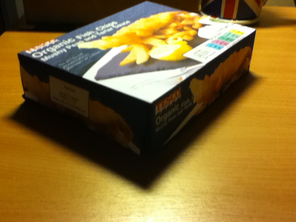
Packaging printed, cut and ready to be folded, fingers crossed it will work ....So happy it all works, never though it would work, it is held together with masking tape, just so i could try it out, it will be glued eventually.


So over all the outcome was a success, the template works and the design is really good, i think if i was to do it next time i would, take my own pictures and because i think the pictures are the only thing that makes it slide slightly where they are slightly pixelated but im very happy with it for my first go!

Franks Packaging project

Although this started out as a group project it had to change to a personal project as people didn't turn up to the next lesson so this is my packaging

I started of drawing the packaging, (not easy, this was the hardest part of the howl design) if this wasn't right this wouldn't fold into a proper piece of packaging
with all the guidelines it was hard to keep track with which line goes to what part, but once i had done one side i could just flip it and group it all together
once i had finished the outline i needed to find picture to make the packaging shout out to customers, i looked into 'Birds Eye' and a few other fish products and they always show the dish with a nice landscape in the back. As mines fish and chips i decided to go with a sea background
i found this picture, i chose it as it was fresh looking and it looked top range, suitable for my product
i then thought of copy right and photoshoped both picture together to make one, making the image my own work
once i had done the images for the packaging, i had to make all the small pieces that completes the packaging, i used illustrator to create this affect, using shapes and text
i created the barcode by hand by counting the lines of another and making lines on illustrator and making them different thicknesses, it turned out pretty well
once i was finished the back of the packaging looked like this, i found that all i had to do is place it in the spot on the packaging, along with the other little bit i designed with it my final before printing, most of the type is is between size 4 t0 12 with the title being as big as 26, i found this packaging a challenge, i think that's why i enjoyed it and the hours put in was between 8 -9 hours over 2 days. im glad its finished though, i feel like i have achieved something, where others left it, i finished !!!!

Thursday, 12 January 2012

final Idea


After experimenting with this quote "be dirty" i have really fell in love with the artwork of , David Carson. Mainly one picture (Image show below) There is something about this image that i find so interesting, It is designed to make a purpose, with the negative space you are forced to look at the type, there is just enough to keep u looking and interested.
Without looking at the type and what it says. The black and white look, i feel like i have to look at it, i love the way you can't quite read the background yet you don't need to, because you know what it says.

Looking at David Carson's work, i have come up with my own idea within his. i really wanted to make mine over the top, to much, but still with the negative space left in. but just not so much that the negative space take over the type Once it was all laid out how i wanted and what looked best, i had to finalised the place of the the white font "BE DIRTY" Ideally i want it in a place where they have to look for it, but not to much, so i have tried out a few places where it could work and then asked peoples opinion!

Bottom Right
Top RightCentered Bottom Left

After everyones opinion, most peoples say they liked the bottom right because of the flow of the design and because its not the first thing you look at, you left guessing till you find it looking at my design, and listening to the opinions, and found that i agree with that they said
i think i also like it because some of the type in the background is left readable and and bigger than the white font, in some ways makes it stand out more, so don't have to look at the white font first to understand what its saying.
I like the way i have left it open for opinion, whether u think "be dirty" in a flirty, playful way or in a "Be Dirty" messy way


how you take the "Be Dirty" quote is up to you !

Monday, 9 January 2012

be dirty - image ideas using type

i wanted to come up with some ideas that was dirty, this is what i came up with
these are also images so im not sure if im aloud to use them, but there good ideas

first ideas for final project -4

i started of thinking about what sort of fonts 'be dirty' relates to which immediately thought of dirty dancing film and the type they have used for the front cover, i found a font that imaged it and had a go, with what i could do with it


then changing the type as i felt it didn't work, to Helvetica (When i first got the quote i really wanted to write, "Be Dirty ..... use HELVETICA" but then soon found out we wasn't aloud to add anything else to the quote, i still might do my own spin off)


i found it hard to choose between the font, layout, size and the colours, i think i need to take another approach to this project

David Carson Ideas 10/1/12

i have found so far, the quote 'Be Dirty' very hard to get ideas for, everything i try isn't really working the way that i won't it to, but came across my essay notes and saw David Carson and thought i would try it out


after developing these designs, i found one that really works, i'm going to try and improve this one slightly and try and get it printed A1 for my final

Task 4 type project

Task 4 - for this project we was asked to just place type in a box (only using black and white)
i came up with a range of ideas but they all seamed boring or not interesting because of the boring type

i got the ides of having negative space around the outside, but i wanted people to look at something


i tried putting them all together but then it looked like a list which is what i wanted to avoid
i wanted to distal the type make it look fun so i tried putting diagonally
or changing the way the list was looked at making the text look a lot more bulkier
but some how i love the side angle affect so i'm trying to change it more
my final outcome
i found i was draw toward the corner, and it had to be the bottom left corner, so after playing with the type and making it all fit in perfectly. once i had finished placing i didn't want to move it, i fell in love with the layout and didn't want to change it
im happy with this outcome!