HI My name is Sam Borton, I have just finished at Canterbury college studying graphic design and is now moving on to study art and design at UCA Maidstone LOOK AT MY WORK AND LET ME NO WHAT U THINK, GOOD OR BAD! likes/dislikes!
Monday, 30 April 2012
Website
Wednesday, 25 April 2012
Title Sequance
This is a very farmer, cowboy style town, i think it would be good if we could get people from Maidstone to do it, it would be amazing to get loads of people to do it, but its finding the people, i think first i will ask people in my class, then maybe as people in the canteen, and if we still need people try town????
Title Sequence
I have found that in later films there not that common at the beginning, there normally at the end or not at all, i really wanted to look and find once that where found at the beginning like traditional once we looked at, at the lecture
I found these once really interested me the most out of the films i found:
Love Actually - I felt that with this, this was shown like a diary entry, he was talking in the 3rd person, while the film is acting it, the sound made it calm (simple piano) and to summer it up at the end, he said "love is all around"
Juno - Shouts out as a teen film when the film starts, it starts of as Juno just walks and shes in a 2D affect, but with the music it creates a peaceful and wonderful beginning
Priscilla Queen of the Desert - original classic film, opening scene , a man dressed in drag, mining to a song about wanting to be free, and it's all happy and innocent, song finishes and you realise hes just in a pub singing to drunken men, coming from dream to reality. the type, is very glaring and in your face, a bit over the top, which goes with the film.
Saturday, 14 April 2012
Leaflet project
On Facebook i put on images showing different parts of the leaflet and then told them to choose which one why liked the most or more likely pick up and read

Megan (my course) liked design 3 - no improvements
Ben (my course) liked design 3 - the front text could be made bigger but thats me just trying to find u an improvement to make
Jake Bussell (illustration 1y) liked design 3 - no improvements
Emma Write (friend) liked design 3 - no improvements
Poppy (friend) 1 is eye catching, 2 has to many colours and 3 is awesome
Natalie (friend) liked design 3 - no improvements
Roseanne (friend) liked design 3 - no improvements
Cloe Ashtari (friend) liked design 3 - no improvements
Andy (friend) liked design 3 - no improvements
Katie (friend) liked design 3 - no improvements
Julio (friend) liked design 3 - no improvements
Rio (illustration 1y) liked design 3 - no improvements
Aaron (my course) liked design 3 - no improvements
Kimaya (friend) liked design 3 - no improvements
Also seeing people in person, have looked at the design and have gone straight to design 3
So people have had a chance to look at all the designs and have made it smaller into 3 designs which i then have improved and then shown again, although people still love the other designs Design 3 the yellow, black and white design, i fell as well as every one else stands up to the brief set and my own brief of sticking with the Swiss Design, I'm fully happy with my outcome!
Monday, 9 April 2012
Leaflet project
Front
Back
Middle
Standing up

Content
But im still going to ask peoples opinion on my design to make sure its as good as it can be !
Leaflet project
Leaflet project
Front
Back
Middle
Standing up

Content
I printed it out to see what it would look like
as i thought it might where its bigger,be planner than i wanted it to be, now its been printed to the right size not sure i like it ??? differently not sure for a final but i will see when i ask peoples opinion.
Leaflet project
Design 1 -So from the final 3 designs being picked i wanted to start again a replace it perfectly, exactly where i wanted it.....
After placing the type where i wanted it, the images where slightly more diffcult to place, i found it was not about them all being in a straight line it was just about fitting them all in, in a way i like the rapidness where there not all in line.But is this design boring still, i know the Swiss Design is simple but is this simple and a bit boring ????

Design 2 - I again stripped the design to its basic form ...
placing the type in and made the type, properly left or right alined, which ment i didn't have (-) at the end of half the word, with the est underneath the line. Adding the images was hard for this design until i thought about just putting them at the bottom, this also ment i could put all the images in, and they where in the column was in the right text.i do like this design but where there is so many colours, i feel that it has developed to far, although i like it, i think i have gone off the path of Swiss Design?????
Design 3- With this design i found was most fun, starting of again by stripping of text
i found when i came to putting the text in again, was a matter of making the text slightly smaller so i could fit the text into the small boxs, and so i could fit the images in properly. i couldn't fit all the images in but i also thought it didn't need an image for each artist descriptioni found once i added the images in i fell in love with this design.

There are pros and cons for each design, so from this i can't pick a final i need to create the other side of it to make it into a leaflet, instead of a poster which is what is it at the moment.
Leaflet project
First Idea
Within this design i used the columns to create structure to the type, i didn't want to center it all so i put it at an angle. This is good as it is, but the brief says we have to have images, this would make it difficult to place on the page. (Design 1)

Second Idea
With this design i looked at an image i found on the internet, just to grab ideas, looking at the design i created my own design, then within that i placed the type where it would fit and make it look interesting, this still gave me space to place pictures but not for all of the artists. (Design 2)

Third Idea
Looking at Swiss Design, a lot of things where red, so i thought i would try just a simple red background, with the type. i found once i had done this, it would be to bold and illegible for you to read. (Design 3)

I tried the same design in blue and found it much better, easyer to read, and very simple. (Design 4)

Fourth Idea
Looking at another layout design on the internet i designed again to make my own vertion, but i found with this is where the lines where placed in a certain way, i found the text hard to place without having to make it really illegible. (Design 5)

My final design
i wanted to try something in thin columns, from looking at Swiss Design, there is a lot of columns, originally there was no colour just black background and white text, i thought i would try it with colour, which i really like. (Design 6)

From talking to a few people on my course, and asking there opinion on my work so far, i found, they had the same views as me, that Designs 1,3,5 where in need of improvements, or are not 100% suitable to the project, where Designs 2,4,6 where good enough designs to be improved and see if i could improve them enough to become a final outcome.
Leaflet project
hopefully within my research i will be able to come up with a design, unlike normal leaflet and make something interesting, something u will want to pick up, and read because it looks interesting.
Within Swiss Design, lies many talented designer, But a few have really court my eye:
-Max Miedinger was a swiss typeface designer, he was famous for creating Helvetica in 1957. Marketed as a symbol of cutting edge swiss technology, even in today's society within graphic design we use helvetica and respect it as a typeface.
I'm not going to be the last person to say it but Helvetica is a magical typeface and my personal favorite, i have found thought out the years of studying gtraphic design, that my work always falls back to Helvetica!

-Le Corbusier, was widely acclaimed as the most influential of the 20th century, was also a celebrated thinker, writer and artist. His architecture and radical ideas for reinventing modern living, from private villas to large-scale social housing to utopian urban plans, still resonate today.
I came across Le Corbusier work, and i became interested on how much it was influenced by Swiss Design, the one thing i understand within Swiss Design is that they work within simple shapes, making in simple but still visually interesting, all that is used here is circles, squares and rectangles.

-Josef Muller-Brockman, was a swiss designer and teacher,throughout out his years he studied architecture, design and history of art, exhibition design and photography. In 1966 he was appointed European design consultant of IBM. He was well known for his simple design, clear use of typography, shapes and colour, which inspired many of the 21st century.
When i was looking for the the first project i came across Muller-Brockman, which i found worked within grids and shapes, very much like we where asked to do. i found his work very interesting, i will be inspired by him while i do my leaflet design.


-Adrian Frutiger, was a typeface designer, influenced the influenced of digital typography, he became well know for creating the typefaces Univers and Frutiger.
I came across Adrian Frutiger at collage, where we did a project where we was asked to design out own type, i found Adrian Frutiger a massive help, within looking at his work, looking at the grid lines to make limitations u can make a defined typefaces.


Using the type provided and my research into the artist and there artwork, i will try layout out the type on a design, then after asking piers opinions i will improve them further and create the front cover to go with it.
Sunday, 18 March 2012
Design Without Boundaries
After looking at the different fold and then doing a few of them as mock-ups, i also thought about which one would be easiest to be carried around, and less fuss, easy to design but still good enough to be designed on
i found with all of the mock-ups i came up with, all of them where thin but very tall, so it would have to be bent again to be put in most bags, where the Quarter Fold is flat, designed easy, easy access, and can still uptain a good design within it
Design Without Boundaries
Below is what we are to write on the leaflet ! Everything written in Blue has been hand written by me
Everything in black has to be on the leaflet as it is written on here!
Design Museum, Shad Thames, London SE1 2YD
0207 940 8790 http://designmuseum.org/contact
Design Without Boundaries
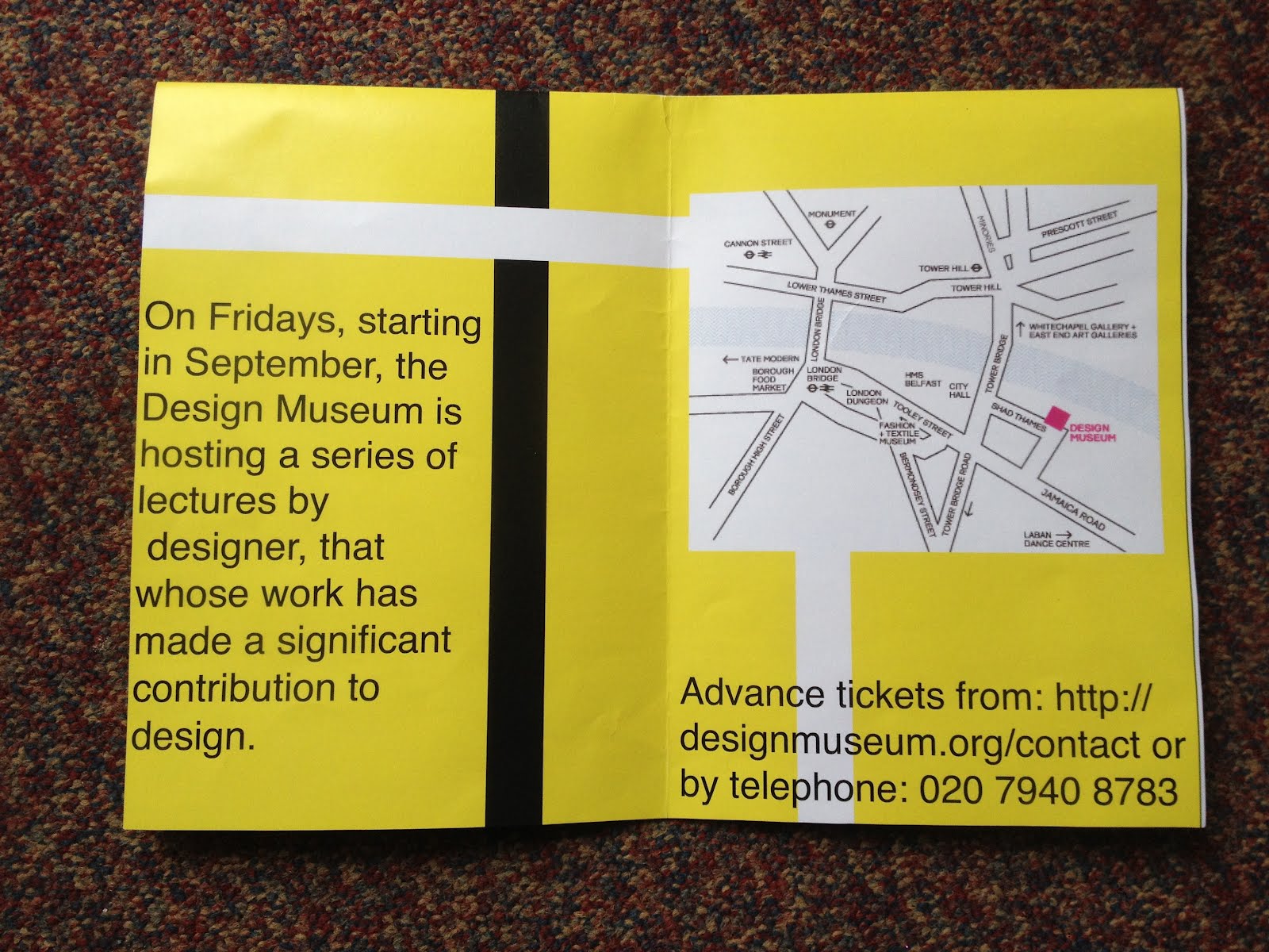
On Fridays, starting in September, the Design Museum is hosting a series of lectures by designers that whose work has made a significant contribution to design.
Advance tickets from: http://designmuseum.org/contact or by telephone: 020 7940 8783
Derek Birdsall Graphic Designer
6.30pm Friday 2nd September
Birdsall’s evolution as a virtuoso book designer is the clearest indication of the principle of transparency that he attaches to design. He is troubled by what he calls the notion of ‘the designer as It’ – as an egocentric expressionist (or Author as current discourse has it) – which is unsatisfying in practice, ephemeral in effect and ultimately even ‘tragic’. The preface to his
2004 book notes on book design – part reflective treatise, part technical manual – introduces
‘simply the decent setting of type and the intelligent layout of pictures based on a rigorous study of content’. This is the organising sensibility of all great graphic designers, who manage to contrive tension and sublimity within the exercise of reason.
i love the old photography look mixed with the printing design, giving it a old look but still quite modern some howl, gives a smooth affect within it
6.30pm Friday 9th September
Many of the most beautiful books to have been designed in recent years are the work of Irma Boom. Born in Lochem, the Netherlands in 1960, Boom has won international acclaim for the iconoclastic beauty of her books. Her most ambitious project to date was a book celebrating the centenary of the Dutch conglomerate SHV in 1996 to which she devoted five years of work.
With this Boom book, it looks massive but in reality its quite small, its interesting, i think, around us 2day we are more interested in the abstract designs !
6.30pm Friday 16th September
Co-founded in 1993 in Amsterdam by the product designer Gijs Bakker and design historian Renny Ramakers, Droog has defined a new approach to design by mixing materials and interacting with the user. They called the collection Droog Design after the Dutch word
‘droog’, which translates into English as ‘dry’ as in the dry wit, or wry, subtle sense of humour that characterised all the pieces they exhibited.
i remember seeing this in london, and thinking this would look brilliant in my room ! where its so different u just want to keep looking at it
Graphic Thought Facility Graphic Designers
6.30pm Friday 23rd September
By defining a distinctive graphic style to a diverse range of projects, Graphic Thought Facility has emerged as one of the UK’s most influential – and productive – graphic design teams. Founded in London in 1990 by Andy Stevens and Paul Neale, GTF now works for such
clients as Habitat, Shakespeare's Globe Theatre and the Design Museum.
The work of GTF is defined less by a distinctive visual language than the rigour with which the designers approach the process of developing and executing graphic projects.
Love the design within this outcome, its like one big light drawing, u have to use ur own opinion to work it out
Hella Jongerius Product Designer
6.30pm Friday 30th September
The Dutch designer works on the cusp of design, craft, art and technology to fuse traditional and contemporary influences, high tech and low tech, the industrial and artisanal.
Standing in the Design Museum Tank on the riverfront was a wooden table laden with food and illuminated by five lamps with ceramic bases and silk shades. On closer inspection it was apparent that the 'food' - a loaf of bread, fish, fowl, sausages and artichokes - was made from hand-blown glass and the lamps were embroidered with images of the animals, inspects and birds printed on the silk. Stranger still, the floor was covered in rich brown soil.
The furniture and book designs are brilliant, well looked into, and thought about !
6.30pm Friday 7th October
Through their work as graphic designers and creative directors in the fields of art, fashion and music, Michael Amzalag and Mathias Augustyniak have established M/M as a powerful force in contemporary French culture.
After meeting at art school in Paris, Michael Amzalag and Mathias Augustyniak founded M/M in 1992. They have sinced worked together as graphic designers and art directors on fashion and art projects mostly for longstanding clients and collaborators – such as the fashion designers Yohji Yamamoto and Martine Sitbon, and the photographers Craig McDean, Inez van Lamsweerde and Vinoodh Matadin.
Alought this design and a lot of M/M's designs are quite gothic and dark, there in a sutle way so there not creepy, there designed in a way that u want to know more!
Jonathan Barnbrook Graphic designer
6.30pm Friday 14th October
Barnbrook is one of the UK’s most active graphic designers. Pioneering the notion of graphic design with a social conscience, Barnbrook makes strong statements about corporate culture, consumerism, war and international politics. Working in both commercial and non- commercial spheres, Barnbrook combines originality, wit, political savvy and bitter irony in equal measures.
I love the plain use of fonts, the block style really works within the design
6.30pm Friday 21st October
Combining commissioned work – typically from fashion, music and art clients – with self- initiated projects, the British graphic designers Damon Murray and Stephen Sorrell have worked together as FUEL since 1991 from a studio in the Spitalfields area of London.
Stefan Sagmeister Graphic Designer
6.30pm Friday 28th October
Sagmeister is among today’s most important graphic designers. Born in Austria, he now lives and works in New York. His long-standing collaborators include the AIGA and musicians, David Byrne and Lou Reed. Striking to the point of sensationalism and humorous but in such an unsettling way that it’s nearly, but not quite unacceptable, his work mixes sexuality with wit and a whiff of the sinister.
I have come across Sagmeister before, it takes skill, courage and a proper designer to do what he does with his work, the design where he attally cut into his skin with type, makes me fill a little cold though.